Back to basics...by Ian
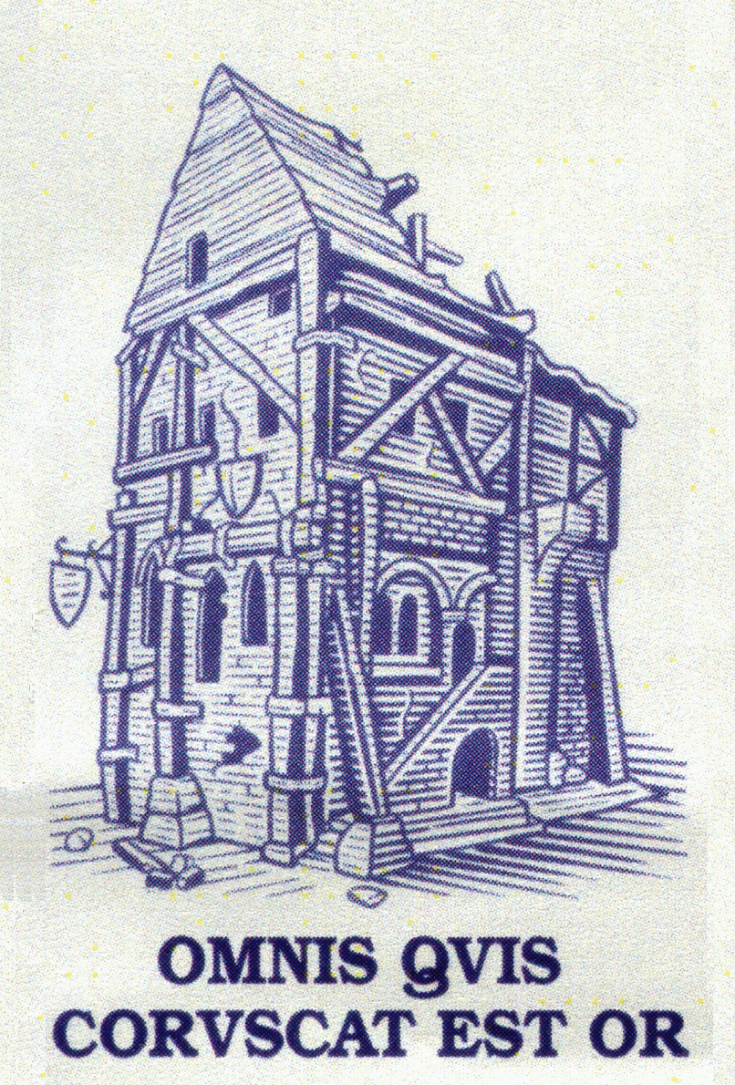
These are some really simple decisions that we consider when designing an image which really helps the finished article feel natural. It‘s all fairly obvious stuff, but it‘s important to get it right. I‘m using the Alchemists‘ Guild building to explain why.
It‘s a matter of perspective...
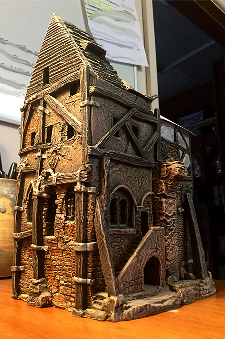
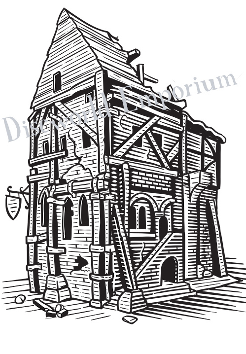
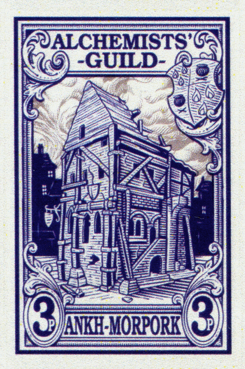
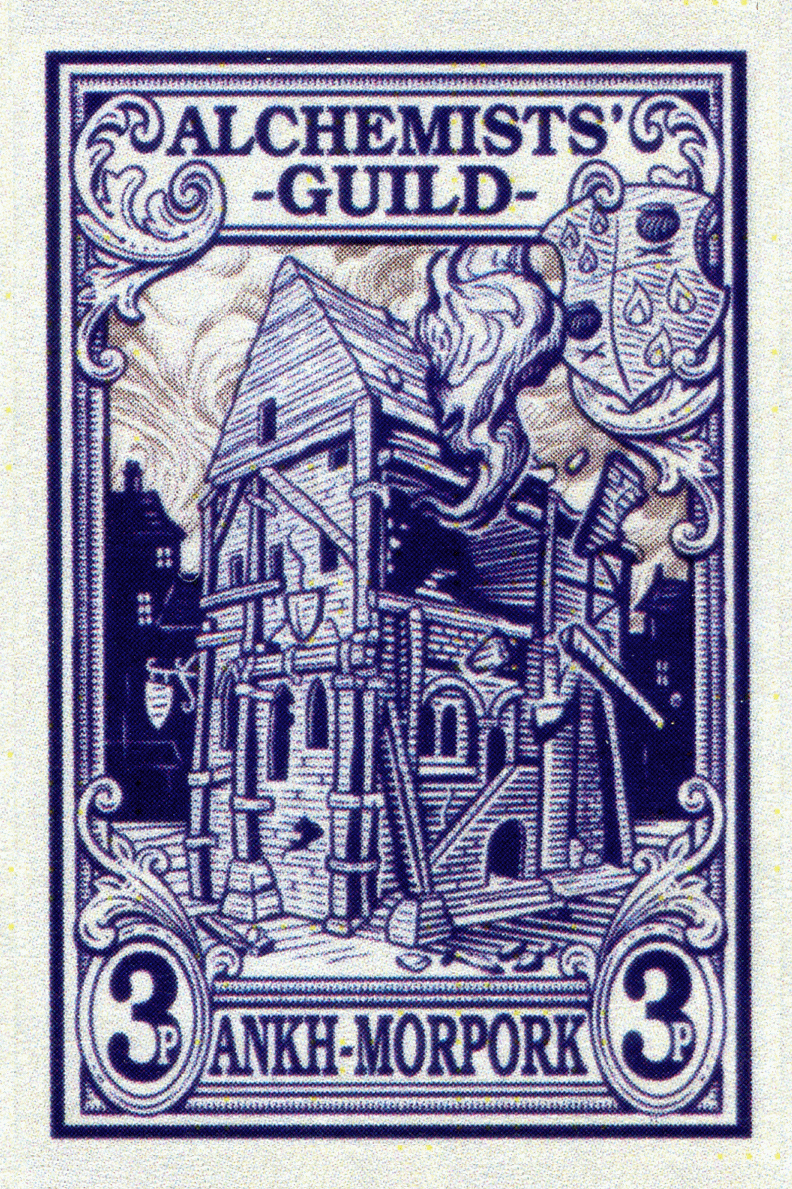
The vast majority of Morporkians would be used to seeing the Alchemists‘ Guild from the street (or possibly spread all over it). If you want to make an image that feels natural, consider how people would be used to seeing the subject. Shooting our reference image for the Alchemists‘ building from a low vantage point, coupled with the use of a simple 2 point perspective and a horizon line, puts your viewer at nearly street level. This is a view we‘re all used to and it feels very comfortable. If you take, for example, the 2005 Thieves‘ Guild stamp (as this image was also produced from one of Bernard‘s models), the artist would have to be some 40ft in the air to gain that perspective. Although this viewpoint makes for a very dynamic image, and a beautiful piece of work, it still feels a bit like a model. The Ten Pence Fools' Guild stamp is also shown from an elevated postion.*
I also wanted to give the building a bit of depth, not always easy in a line drawing, so we lit it very simply. One bright light on one edge. This gives the eye two very simple planes to work with. Again, a very simple trick, but it all helps to create a basic illusion of size, depth and mass. Designing your image in this way means that a lot of the work is done for you, allowing you to play around a bit more with other elements to add character and dress it up a bit.
* I‘m not detracting from these lovely stamps, it‘s just not the style I was going for here.
Walk the Line...
Keeping the image looking crisp and tidy also helps people to read the image clearly and instantly feel comfortable with it. To help this you need to select the right range of line — weights (or thicknesses). We have a lot of experience in how a design replicates at such a small size, which helps, but a good rule of thumb to make a very clear image is to choose a couple of key tonal values and assign a thickness to each. In this case I wanted to keep plenty of detail in the shadows, so I chose to use a line in the darkest shadow that was about equal to the spaces between the lines. This also allows you to have some deep shade without it feeling too heavy and blobby. I halved the line weight on the lighter planes to keep things clear. Another simple trick is to round off the lines towards the shade and and terminate them with a joining stroke, whilst leaving a little white space towards the light source — this just helps to emphasise the shape of the object.
Be an Imperfectionist...
When designing a stamp, making your image as legible as possible is very important. Simplifying your shapes helps people to read the image, but it can make for a very sterile picture. If you want a bit of life in there, you have to pick a few key details and exaggerate them slightly. For example, one or two really bold cracks in the building do an awful lot more than 15 little ones and it doesn‘t confuse the illustration. To carry this off without the image looking too cartoony, you really need the overall structure of the image to be sound. Once you‘ve done that you can play around with a few wiggles, break some of the formal lines up, leave a little bit of personality in the picture. If your overall structure is right it will stand these few minor imperfections and, in my opinion, be all the better for it. There‘s nothing worse than having an image which leaves nothing for the eye to do. If things are too perfect, the image simply won‘t feel ‘real‘. You also don‘t want it to be so scrappy and wild that you can‘t read the. Basically, in my opinion, if you‘re hand drawing the image, let it show!
I know this all sounds very basic, and it is, but when working in a cat–filled loony–magnet like the Emporium, you‘d be amazed at how easy it is to forget the basics!
Articles
Here you will find articles mostly related to stamps, Discworld and elsewhere.
Wanted
We welcome articles from everyone, so if you feel you have something to say which will enlighted all the subscribers to the Journal please feel free to send it to the editor.
Don‘t be shy.

The Stanley Howler Journal is brought to you by the Discworld Emporium where you can find all your Flatalist needs.
August 22
January 21
Welcome the Year of the Beleaguered Badger
December 19
Year of the Condescending Carp
April 17
October 16
June 16
May 16
March 16
November 15
September 15
